Introduction
Creating an eye-catching magazine cover story requires blending art and science. It’s about understanding the elements that need to be present on the cover and mastering the design process to attract the readers. This blog post delves into the critical components that make up a magazine cover and shares 10 essential rules to follow when designing one from scratch. Whether you’re an experienced designer or a novice, this detailed guide will help you create compelling cover stories that captivate and engage your audience. With practical tips and industry insights, you’ll gain the knowledge needed to produce magazine covers that stand out on the shelves and draw readers in.
Table of contents
- What must a magazine cover have?
- Masthead
- Issue and dateline
- Main image
- Lead article
- Supporting cover lines
- Bar code
- How to design a magazine cover from scratch
- 10 Golden Rules of Magazine Cover Design
- 1. Place the masthead in the most obvious place
- 2. Work with grids and layouts
- 3. Be consistent with your cover design format
- 4. Decide on a focus point and build everything else around it
- 5. Play with font styles
- 6. Emphasize powerful words
- 7. Learn to use color & contrast
- 8. Place a portrait on the cover
- 9. Avoid busy backgrounds
- 10. Give illustrations a chance
- Lessons learned
- Frequently Asked Questions
- 5 Comments
- Leave A Comment
What must a magazine cover have?
Masthead
The masthead, or title, of a magazine is one of the most important aspects of its cover. It’s the nameplate that readers recognize and associate with the magazine’s brand. Typically, it is placed prominently at the top of the cover for instant identification. The masthead sets the tone and brand aesthetics for the magazine, thus consistency in style, font, and color is crucial.
Not only does the masthead help in branding, but it also builds reader loyalty. A clear and high-impact masthead ensures that the magazine is easily identifiable on a crowded newsstand.
Issue and dateline
The issue number and dateline inform readers about the specific edition of the magazine. This information is usually positioned near the masthead or in a corner, ensuring that it is visible yet does not distract from other design elements. It allows readers to keep track of the publication sequence and ensures that they are purchasing the correct issue.
Including the issue number and date also helps in cataloging and archiving the magazine for future reference. It adds a professional touch and communicates the magazine’s regular publishing cycle to the audience.
Main image
The main image is often the most compelling element of a magazine cover. It grabs attention, sets the mood, and draws readers into the content. This image usually aligns with the lead article or overarching theme of the issue. It needs to be high-quality and eye-catching to stand out amongst various competitors on the shelf.
Choosing the right main image can hinge on various factors, including relevance, visual appeal, and emotional impact. The image should communicate a strong narrative or evoke curiosity to encourage potential readers to pick up the magazine.
Lead article
The lead article is the focal point of a magazine issue, often hinted at with a captivating cover line that entices readers. This headline should be bold, strategically placed, and easily readable. It should promise value, whether it’s exclusive content, breaking news, or an intriguing story.
Effective lead articles highlight the magazine’s unique angle and strengths. Emphasizing exclusivity or offering solutions to common problems can make the lead article irresistible to pick up and read. This drives reader engagement and enriches the reading experience.
Supporting cover lines
Supporting cover lines serve to inform readers about other noteworthy articles within the issue. These need to be well-organized and strategically placed to avoid clutter. They act as teasers that arouse curiosity, persuading readers to explore the magazine further.
They’re an opportunity to showcase the breadth and depth of the magazine’s content. Choosing strong, engaging cover lines can make a significant difference in convincing readers to purchase the issue.
Bar code
The bar code is a functional but essential element of any magazine cover. It facilitates the point-of-sale transactions and helps in inventory tracking. Positioning is important; it should be placed in a way that is accessible but does not detract from the overall design of the cover.
Typically, the bar code is placed in the bottom corner of the cover. Ensuring it is readable yet aesthetically integrated into the design can balance function and form effectively.
How to design a magazine cover from scratch
Here are the 10 golden rules of magazine cover design:
1. Place the masthead in the most obvious place
The masthead should be positioned where readers expect to see it, generally at the top of the cover. This enhances immediacy and brand recall. Consistency in placement helps build a strong magazine identity and makes the publication instantly recognizable.
Being predictable isn’t necessarily boring; in fact, it provides reliability that can reinforce reader loyalty. A well-placed masthead lays the groundwork for an effective cover design.
2. Work with grids and layouts
Employing a grid system is fundamental in maintaining an organized and visually appealing layout. Grids help in aligning text, images, and other design elements, ensuring a harmonious and balanced cover design.
Grids also streamline the design process, making it easier to manage elements and create a cohesive look. They provide a framework within which creativity can still flourish.
3. Be consistent with your cover design format
Consistency in cover design fosters brand identity and reliability. Stick to a format in terms of font styles, color schemes, and placement of key elements like the masthead and issue number. It helps create a familiar look that readers can associate with your publication.
This doesn’t mean you can’t innovate; it simply means that drastic changes in format should be well-considered and purposeful, ensuring they align with the brand’s evolution.
4. Decide on a focus point and build everything else around it
Choose a focal point for your cover, whether it’s the main image, a bold headline, or an impactful design element. This focus point will grab attention and draw readers in. Build the rest of the cover elements around this central feature.
A clear hierarchy and focus point guide the reader’s eye, creating a natural flow that enhances the cover’s readability and appeal.
5. Play with font styles
Fonts can elevate the aesthetic appeal of a magazine cover. Experiment with different font styles to highlight headlines, supporting cover lines, and other text elements. However, use only a few font families to maintain a clean and professional look.
Contrast in fonts can add emphasis and guide the reader’s attention through the cover, but make sure the chosen fonts reflect the magazine’s tone and target audience.
6. Emphasize powerful words
Use impactful, powerful words in your headlines and cover lines to catch the reader’s attention. Words that evoke emotion or curiosity can make the cover more compelling.
Emphasizing keywords by making them bold or using a different color can enhance their impact and draw readers in even more.
7. Learn to use color & contrast
Color and contrast are critical in making your magazine cover stand out. Use colors that align with your brand but also catch the reader’s eye. High contrast between text and background ensures readability.
Strategic use of color can highlight important elements and create a visually dynamic cover. Remember to balance contrasting colors to maintain a cohesive and appealing design.
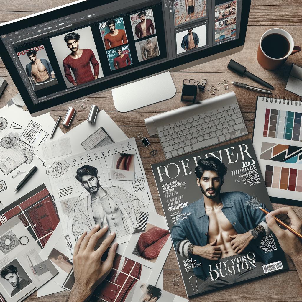
8. Place a portrait on the cover
A well-composed portrait can add a human element to the magazine cover. If applicable, place a high-quality portrait aligned with your lead article to set a personal tone and intrigue readers.
Ensure the portrait is engaging, well-lit, and exudes the essence of the story it represents. This can significantly enhance reader connection and interest.
9. Avoid busy backgrounds
A cluttered or overly busy background can detract from the main elements of your cover. Opt for simpler, cleaner backgrounds that make the text and main image stand out more prominently.
Less is often more when it comes to backgrounds, helping maintain focus and clarity on the important elements of the cover.
10. Give illustrations a chance
Illustrations can offer a unique and creative flair to your magazine cover. They can be custom-designed to fit the theme and brand, offering versatility that photographs might not always provide.
Illustrations can make your cover stand out in a sea of photographs, providing a distinct and memorable aesthetic appeal that resonates with readers.
Lessons learned
| Element | Importance | Design Tips |
|---|---|---|
| Masthead | Brand Identification | Consistent placement, high impact |
| Issue and Dateline | Edition Information | Placed near masthead, professional touch |
| Main Image | Grabs Attention | High-quality, relevant, eye-catching |
| Lead Article | Main Focus | Bold headline, strategically placed |
| Supporting Cover Lines | Content Teasers | Well-organized, engaging |
| Bar code | Sales & Inventory | Accessible, integrated into design |
| Design Rules | Best Practices | 10 golden rules for effective design |
Frequently asked questions
Q: How important is the masthead?
A: The masthead is crucial for brand identification and reader recognition. It’s often the first thing readers see and serves as a consistent branding element.
Q: Can I use multiple main images?
A: While it’s possible, having one strong main image is usually more effective. It ensures a clear focus and avoids clutter.
Q: How do I choose the right colors for my cover?
A: Select colors that align with your brand and use high-contrast combinations for readability. Don’t shy away from experimenting, but ensure the result is cohesive.
5 Comments
Leave A Comment